-
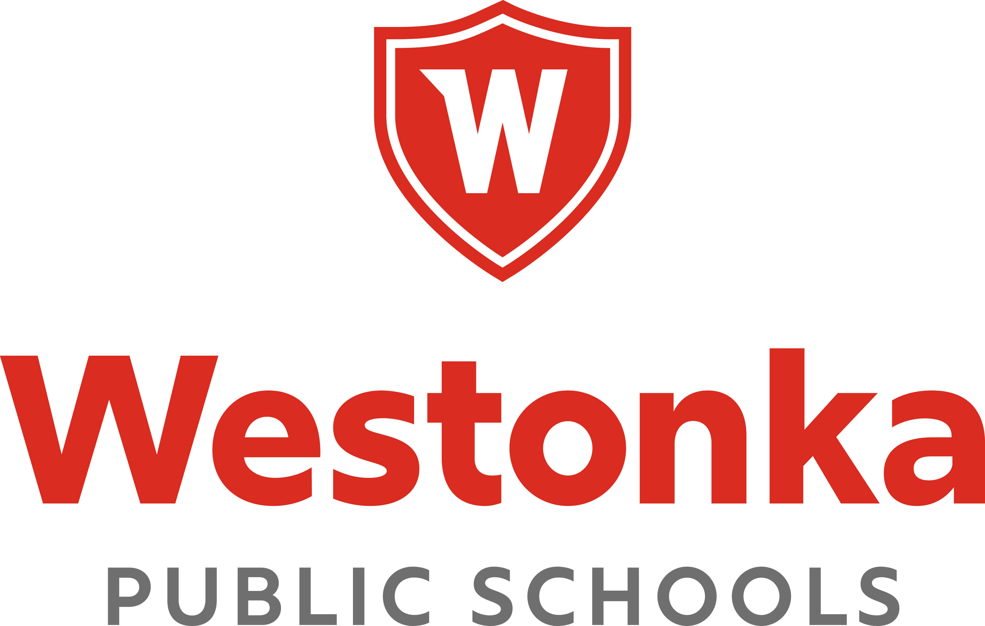
 Our strong, stable W reflects the comfort and spirit of our close-knit Westonka community. The shield embracing the W underscores this strength and security, with the waved shape giving a subtle nod to Lake Minnetonka. The top left of the W points westward, also giving a hint of a White Hawk’s wing and providing a sense of motion to propel our district forward. This cohesive design extends across all aspects of our district, including athletics and activities. We are truly one Westonka.
-
District Logo
-
Westonka W Icon
-
School Logos
-
Community Ed Logo
-
White Hawks Logo
-
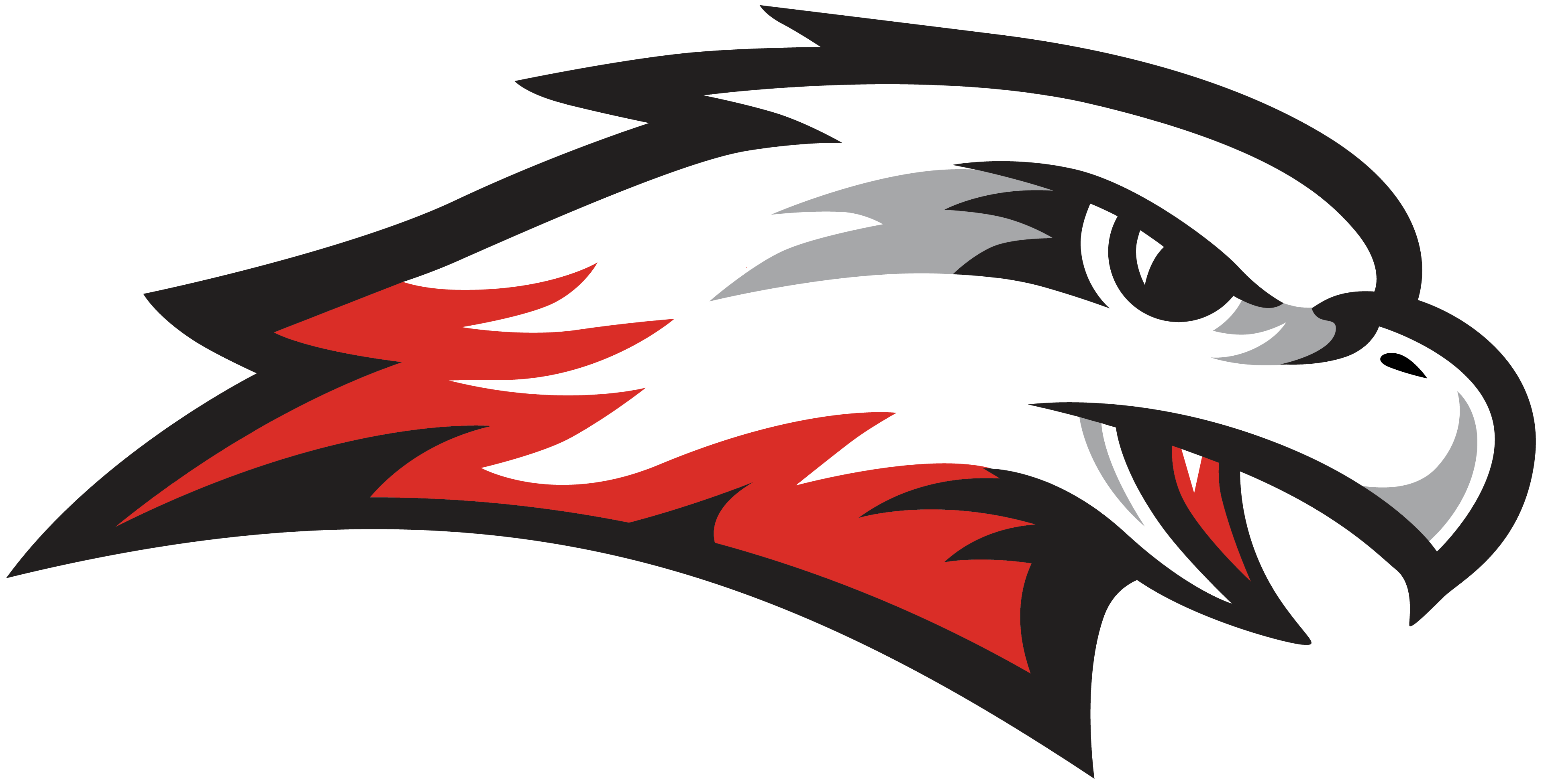
Hawk Head Icon
-
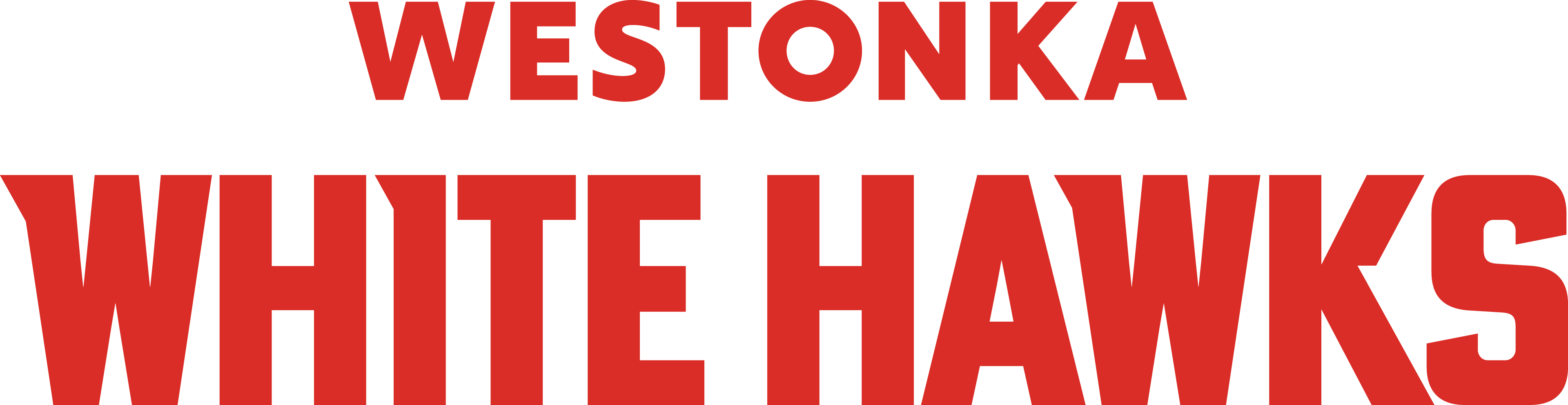
White Hawks Wordmark